 RealReaction AI
A product page has one job: help a shopper decide quickly and feel safe buying. Most pages lose people on a handful of small things, such as unclear shipping, weak photos or a hidden return policy. Use this checklist before you spend money on traffic.
The first screen
- The product name says what it is, in plain words.
- The main photo shows the product clearly and still reads at thumbnail size.
- The price is visible without scrolling, with any sale price clearly marked.
- The main button says what happens, such as "Add to cart", and stands out from everything else.
Photos and description
- There are at least three photos: front view, a detail or angle, and one showing scale or use.
- The description starts with what the product does for the buyer, then lists specifications.
- Size, material, dimensions and what is included are easy to find.
- Variants (size, color) are easy to choose and show which are out of stock.
Shipping, returns and trust
- Shipping cost and delivery time are shown on the product page, not only at checkout.
- The return policy is one click away and written in plain language.
- Reviews or ratings are shown, and some include details, not just stars.
- Contact details and payment options are visible, so shoppers know a real business is behind the page.
Mobile and speed
- Photos swipe, buttons are easy to tap, and nothing sits too close together.
- The page loads in a few seconds on a phone.
- The "Add to cart" button is easy to reach without a long scroll.
The questions your page should answer
Shoppers rarely say why they leave. These are the questions they silently ask, and the page should answer each one quickly:
- Is this what I am looking for?
- Is it worth the price?
- Will it fit, work or arrive when I need it?
- What if I do not like it?
- Can I trust this store?
If a page does not answer one of these, shoppers go back to search results or a competitor.
How to find out which one is costing you sales
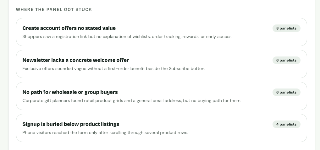
Stuck points from a sample shop review, ranked by how many panelists hit each one.
You are too close to your own product pages to see the gaps. Run a RealReaction AI review on a product page and read the "where the panel got stuck" list. If several simulated shoppers raise the same hesitation, such as unclear shipping or missing sizing, fix that first. Then re-run the review to confirm it went away.
The panel is simulated, so treat it as a quick first read. Confirm changes with real data, such as conversion rate and add-to-cart rate.
For photos specifically, you can test two to six options and see which one 30 simulated shoppers pick.
Quick summary
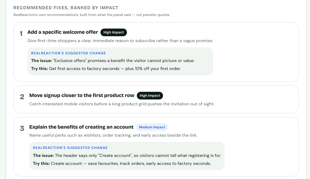
Recommended fixes from the same sample review, ranked by impact.
- Make the main photo, price and button clear on the first screen.
- Put shipping and returns where shoppers can see them.
- Show real reviews and contact details.
- Check mobile first.
- Test before you spend on traffic.