 RealReaction AI
Sample Photo Review for eCommerce
Pick the product photo shoppers actually will click on and buy.
Audience: Online shoppers choosing a ceramic mug. Goal: choose the lead photo.
Sample test of photos — actual output from 30 simulated viewers, not human research or a customer test.
Photo A wins — 20 of 30 picked itClear winner
Image A decisively won the panel's vote, primarily because its lifestyle presentation created an emotional connection and allowed panelists to envision the mug as part of a desirable experience. While some appreciated the clarity of Image B, the majority found Image A's warm, aesthetic, and contextualized depiction more compelling for a handmade item.
- Creates an aspirational lifestyle and emotional connection.
- Showcases the mug's texture and handmade charm in natural light.
- Provides a better sense of scale and how the mug fits in a hand.
Where the eye goes first: In Image A, the eye is immediately drawn to the mug being held, then naturally follows the hand to the warm coffee and the inviting breakfast scene.

First impression: Cozy, inviting, aesthetic
+ Strong emotional appeal and context; Excellent lighting highlights texture
− Mug's full shape not entirely visible; Some details obscured by hand
Distractions: The croissant and flowers enhance the scene rather than distract, contributing to the overall mood.
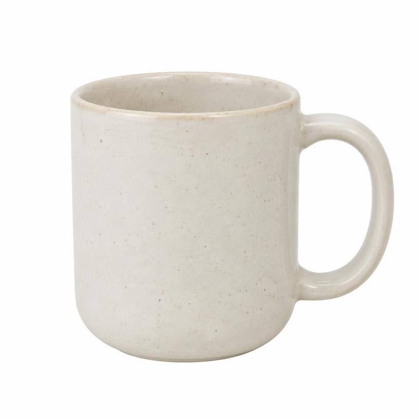
First impression: Clear, simple, product
+ Unobstructed view of the product; Accurate representation of shape and color
− Lacks emotional connection or context; Doesn't convey handmade charm effectively
Before you publish
- Slightly adjust the angle or hand position to reveal more of the mug's base and full shape without losing the natural feel.
- Consider a very subtle increase in contrast to make the mug's speckles and texture pop even more.
- Experiment with a slightly wider crop to include a bit more of the cozy background elements, enhancing the lifestyle feel without making it too busy.
Optional · bonus tips
Ways to get even more votes next time
Ideas to try in your own editing tool or on a future shoot.
Photo AAmplify what worked
- The warm side light and table setting won this — a slightly tighter crop so the mug fills more of the frame could make it read even faster in a small listing thumbnail.
- Worth trying a slightly lower, eye-level angle so the speckled glaze and handle catch even more of that morning light.
Photo BFit for this audience
- For shoppers comparing many similar listings, a soft shadow under the mug and a slight three-quarter angle would show its shape and texture even more clearly.
- Keeping this clean shot as a second gallery image helps detail-focused buyers check the glaze and handle.
What the panel said
28, graphic designer in Brooklyn, looking for a unique mug for her new apartment, browsing on her iPhone during her commute.
"Wow, this looks so cozy and inviting, I want that whole vibe!"
Image A instantly makes me visualize myself using the mug, enjoying a slow morning. Image B is too sterile; it doesn't convey the handmade charm at all.
45, software engineer in Austin, searching for a sturdy, stylish mug for his home office, scrolling on his work laptop.
"I need a clear shot of just the mug to see what I'm actually buying."
While A is nice, I can't get a good, unobstructed view of the mug's full shape and texture. Image B shows me exactly the product, which is what I need first.
32, stay-at-home parent in rural Oregon, thinking about a gift for her sister, using her older Android phone during naptime.
"This picture makes me feel like I need that mug and that whole breakfast experience."
Image A really sells the lifestyle and feeling, which is great for a gift idea. The mug looks like it fits perfectly into a cozy home setting, not just a plain object.
58, retired teacher in Florida, buying a replacement mug for his favorite, viewing on his tablet after dinner.
"Just show me the mug clearly, no distractions."
I want to see the details of the mug itself without other items competing for attention. Image B lets me focus on the color, speckles, and handle shape.
22, college student in Boston, searching for a cute mug for her dorm room, browsing on her phone between classes.
"This photo makes me want to buy the mug AND the croissant!"
Image A is super aesthetic and makes the mug look desirable. Image B is just a mug, I could find that anywhere.
39, freelance photographer in Denver, looking for new kitchenware, checking out options on his desktop computer.
"Need the clean product shot to properly evaluate what I'm getting."
While A is beautifully composed, it doesn't give me enough detail about the mug's actual surface and proportions. B is essential for product assessment.
67, grandmother in Arizona, searching for a thoughtful birthday gift for her granddaughter, using her iPad.
"Oh, this looks so warm and inviting, perfect for a gift!"
The lifestyle photo in A helps me imagine my granddaughter enjoying her morning coffee with this mug. It makes the mug feel special, not just a practical item.
30, barista in Seattle, seeking a new personal mug that feels good to hold, on his phone during a break.
"I can almost feel the mug in my hand and picture myself drinking from it."
Image A does a better job of showing the scale and how it fits in a hand, which is important for comfort. The lighting is also really appealing.
51, small business owner in Georgia, looking for new inventory for her gift shop, browsing on her work laptop.
"I need to see the product clearly and consistently for my own store."
For a main listing photo, Image B is crucial for showing the exact product without lifestyle distractions or specific staging. I'd use A further down the page.
26, graduate student in Chicago, buying a mug for himself after breaking his old one, quickly scrolling on his phone.
"Just show me the mug so I can decide if I like it or not."
I don't care about the whole breakfast scene, I just want to see the mug. Image B is straightforward and lets me assess the actual product quickly.
29, freelance graphic designer in Denver, looking for unique housewarming gifts on his iPhone.
"Oh, this looks like a cozy morning, I can see myself using that mug."
Image A really sells the experience of owning the mug. Image B is fine for detail, but A makes me want to buy it immediately. The lighting in A is beautiful.
45, busy mom of two in upstate New York, scrolling on her tablet during dinner prep, always looking for stylish kitchen items.
"That croissant looks delicious, and the mug feels so warm."
Image A sets a mood and helps me envision the mug in my home. Image B is just a mug; I need more context to justify the price for a handmade item.
62, retired teacher in Florida, browsing for a new favorite coffee mug on his desktop PC.
"A-ha, that's a nice, substantial mug, looks good with coffee."
Image A gives me a better sense of the mug's size and how it fits in a hand. The bright window light really highlights its texture. Image B looks a bit too plain.
22, college student in Portland, Oregon, shopping for a gift for her roommate on her phone.
"This looks super aesthetic and chill, perfect vibe."
Image A shows the mug in action and makes it feel like part of a desirable lifestyle. Image B is just a product shot, which I'd expect lower on the page for details.
38, software engineer in Austin, Texas, looking for a new mug for his home office on his work laptop.
"Nice light, makes the mug look good and substantial."
Image A provides a sense of scale and materiality, which is important for a $28 mug. I can see the texture and the warmth it conveys, which B doesn't quite capture.
50, interior decorator in Atlanta, browsing for unique pieces for a client's kitchen on her tablet.
"Such lovely natural light, really showcases the ceramic texture."
Image A is much more appealing; it highlights the handcrafted feel and the subtle flecks in the ceramic. Image B is too stark and doesn't convey the charm of a handmade item.
27, barista in Brooklyn, New York, trying to find a high-quality mug for his personal collection on his phone.
"Okay, that's a simple, classic shape, good for coffee."
For a main listing photo, I prefer Image B because it clearly shows the entire mug without distractions. I can assess its full shape and color accuracy better. I appreciate lifestyle shots, but not as the first thing I see for a product like this.
31, elementary school teacher in rural Kansas, looking for a durable mug for daily use on her desktop at home.
"Looks like a comfortable mug to hold, very inviting."
Image A gives a better idea of the mug's scale and how it feels in a hand, which is important for comfort. The lighting makes the texture pop nicely. Image B is a bit too clinical for a handmade item.
42, project manager in Chicago, trying to find a unique gift for his wife on his smartphone during his commute.
"Looks like a great gift, very warm and cozy vibe."
Image A makes the mug look like part of a pleasant experience, which helps sell it as a gift. The hand holding it provides a good sense of proportion. Image B lacks that emotional connection.
58, part-time gardener in suburban Maryland, browsing for a nice mug to enjoy her morning tea on her iPad.
"Oh, that looks so pleasant and relaxing, I can almost smell the coffee."
Image A truly captures the essence of a tranquil morning, making the mug feel special. The soft light and natural elements enhance its appeal. Image B is just a plain object, nothing special.
48, marketing director in Seattle, looking for a unique gift for a colleague, on her work laptop during a break.
"Image A makes me want to start my day with this mug; it feels so cozy."
The light and setting in Image A immediately sell a feeling, not just a product. Image B is fine for detail, but it doesn't create any emotional connection or context.
29, software engineer in Austin, trying to upgrade his home coffee setup, viewing on his phone.
"I need to see the mug clearly, without all the extra stuff."
Image B shows the product directly, which is what I click on a listing for. Image A is nice, but it distracts from the mug itself and I can't quite see its exact texture or shape as clearly.
35, stay-at-home parent in rural Vermont, browsing for new kitchen items, using her tablet.
"This looks like a lovely morning ritual I'd want to be part of."
Image A is much more inviting and helps me imagine this mug in my own home. The background elements like the croissant and flowers add to the appeal without being overwhelming.
55, retired teacher in Florida, buying a gift for his daughter, on his desktop computer.
"The whole scene in A feels so peaceful and high-quality."
Image A presents the mug as part of a desirable experience, making it seem like a nicer gift. Image B is just a mug; it doesn't convey the same warmth or value.
22, college student in Boston, decorating her first apartment, on her phone between classes.
"Totally aesthetic, I want my mornings to look like this!"
Image A is definitely more Instagrammable and shows how the mug fits into a vibe. Image B is just a basic product shot, which I'll look at later for details, but it's not a scroll-stopper.
40, freelance graphic designer in Denver, searching for a new daily mug, using his laptop.
"I need to see the object itself, free of distractions, to judge the design."
As a designer, I appreciate a clean product shot like B that highlights the form and texture without a busy background. Image A is pleasant, but it makes it harder to truly inspect the mug's details.
62, empty nester in Arizona, looking for a housewarming gift, browsing on her iPad.
"This photo makes me feel relaxed and cozy, perfect for a gift."
Image A perfectly captures the feeling this mug would bring to someone's home. The warm lighting and natural elements make it very appealing for a gift, conveying comfort and quality.
31, project manager in Chicago, quickly scrolling for a mug, on his phone during his commute.
"Just show me the mug, I don't have time for a story right now."
For a main listing photo, Image B is more effective because it's instantly clear what the product is. Image A is a nice secondary shot, but as a first impression it's a bit too busy to quickly identify the product.
27, baker in Portland, Oregon, looking for rustic homeware, using her phone.
"The whole setup in A just feels so warm and authentic."
Image A captures the handmade, rustic aesthetic I'm drawn to, especially with the croissant and natural light. It really highlights the lifestyle associated with a ceramic mug from a small shop.
50, financial advisor in New York City, buying a practical item, on his office computer.
"I want to see the item clearly to assess its quality and color."
Image B gives a straightforward view of the mug itself, which is what I prioritize when buying something online. Image A has too much going on in the background, making it harder to focus solely on the mug's features.
These panelists are simulated, not real people. Treat the result as a fast second opinion, not a guarantee.
How it works
Step 1
1. Upload 1–6 photos
Tell us what the photo is for and who should love it. Set context, demographics, and ask specific questions.
Step 2
2. 30 simulated viewers react
Each persona votes and explains what grabbed or lost them.
Step 3
3. Get a clear winner
See the ranking, the reasons and what to change before you post.
A faster feedback loop
Why RealReaction AI for Photos?
You've stared at the shots for hours. Your team has their picks. But visitors judge an image in a fraction of a second. RealReaction gives you an objective 30-person panel matched to your target audience to pick the winning photo before you post, list or launch — with clear votes, candid reasons and actionable tips in under five minutes.
Audience-matched perspectives
Shape panels around the viewers you actually need to persuade—Austin homebuyers, beauty shoppers, or tech professionals—rather than relying on coworkers or friends.
Candid, objective reactions
Friends and colleagues won't tell you when an image looks staged, washed out, or low-trust. Simulated viewers judge your photos with total honesty and zero politeness bias.
Decisions in under five minutes
30 viewers vote on your candidate photos and explain their choices fast enough to decide inside your normal workflow, before you publish or spend a dollar on ads.
Actionable tips, not just a score
Get more than a vote tally. Paid tests include specific suggestions on lighting, cropping, angle and framing so your next shoot performs even better.
Questions
Photo tests use credits from any paid plan (Growth covers about 96 comparisons). See pricing
From $49 once or $19/month. 2 free photo tests to start.